“College – what age group is that in your country?” Conversations about education start with definitions. Every country has its own system. This is even more challenging for international policymakers. How do they compare investments and results? Does every child have equal possibilities to learn and fully take part in society?
So, how to map educational systems? The ISCED classification is the main part of the answer. It has eight ranges, from ISCED 1 (primary education) to ISCED 8 (doctorate). Countries categorize schools and institutes within these ranges. ‘Educational diagrams’ can thus show the buildup of a system – a framework for comparison. How to help editors to create such diagrams? And how to integrate them in a website? The UNESCO International Centre for Technical and Vocational Education and Training (UNEVOC) asked our help.
Educational diagrams
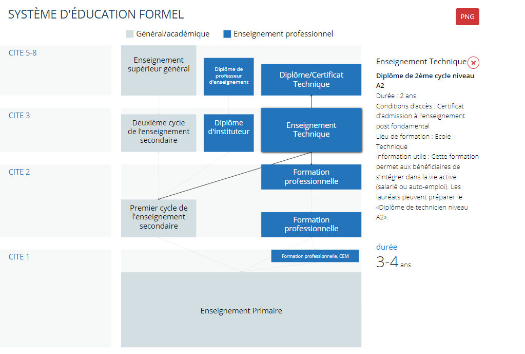
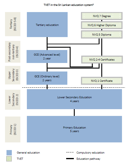
Usually, educational diagrams are vertical. University as literally the higher education. Examples are the detailed diagrams by the OECD (2020). Arrows show how a student can move up through the system. UNEVOC had made comparable diagrams (see image below). Their design highlights the position of vocational education. Alternatively, the UNESCO Institute for Statistics introduced a beautiful series of horizontal diagrams (2021). They invite you to look at education more as part of a life span. All of these are great ways to see the system at a glance.
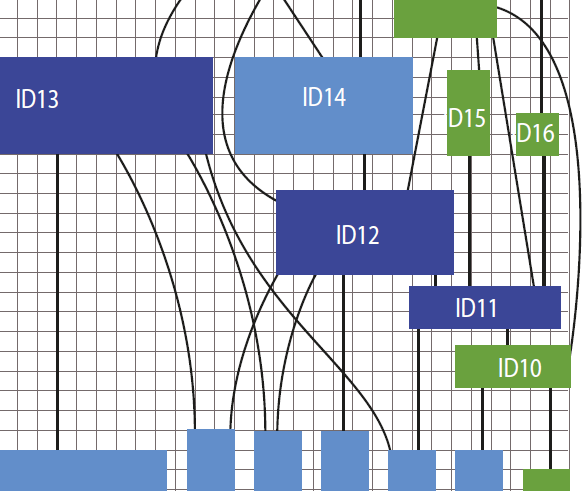
UNEVOC created their diagrams one by one. Thus, the diagrams can easily show different types of institutes and complex flows. The process though is time intensive. Additionally, the result is a still image. It can be inserted in a publication or feature on a web page. But it lacks the potential of a dynamic component on a website. UNEVOC asked us to write an algorithm to help create the educational diagrams. And to make them web friendly. The resulting diagrams, launched in 2021, are part of the online TVET Country Profiles we developed earlier for this client.
Algorithm
Trade-offs are part of automation. A small set of general rules may be too blunt to handle individual cases. A wider set of rules will become too complex. We offered UNEVOC to find a balance that would work well for most countries and adequately for all. Another consideration was to allow for manual editing. But moderately so, as re-running the algorithm will override edits. The algorithm is entirely written in JavaScript.
As input, we defined an online editor. The client enters properties for each ‘block’ of an educational system – ISCED-range, year span, type and preceding blocks (flow). With these, the algorithm should be able to render a good diagram for the majority of countries. Two corrections are available to the editor. A flow override forces the horizontal position above a specified, lower block. And as a last resort, a position override lists a desired width and position.
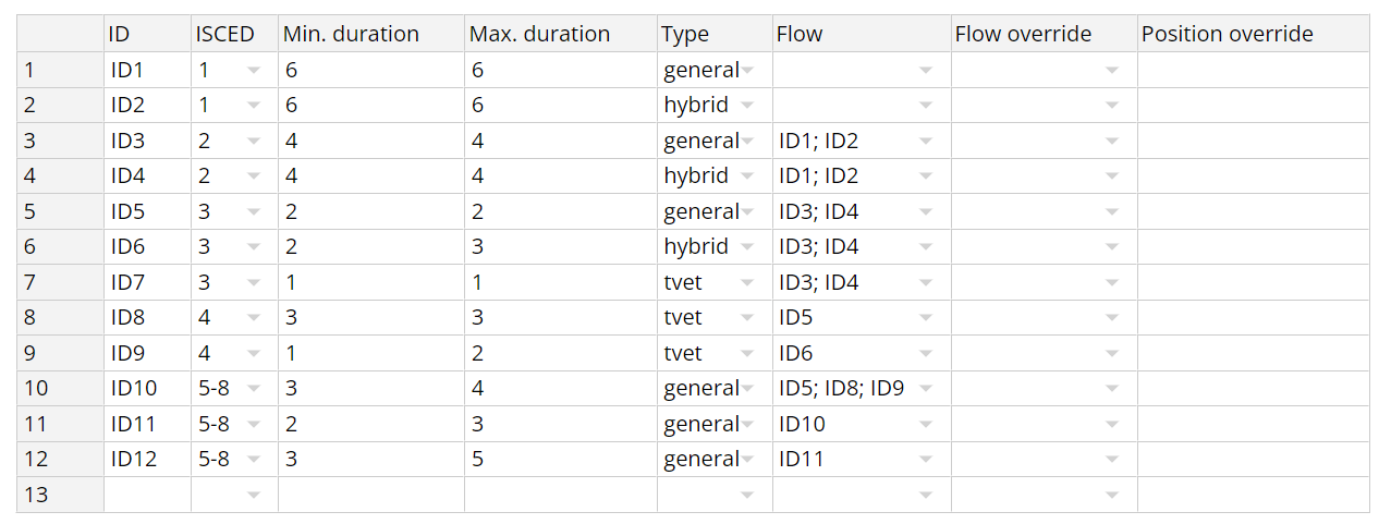
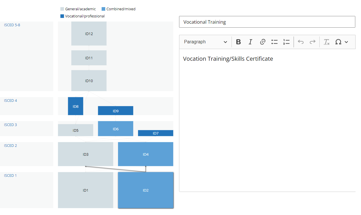
Put to the test, the algorithm creates diagrams that come satisfactory close to the handcrafted ones. The editor can easily add or remove items, change dependencies and run a new version of the diagram.
Web-friendly
Having determined the size and position of all items, we embedded the diagrams seamlessly in the page architecture and visual design of the TVET Country Profiles. The code makes the diagram and each separate item a dynamic part of the web page.
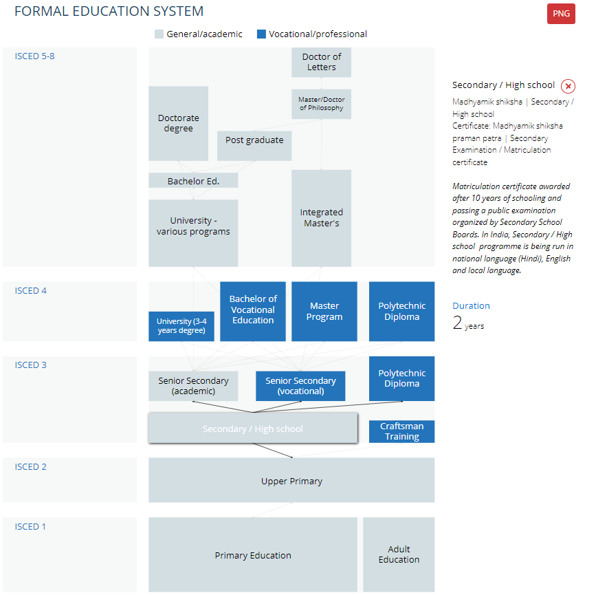
Educational diagrams, like any chart or map, run the risk to contain too much information. Opposed to print, a web component has more ways to feed the information. The UNEVOC diagrams show less information in default state – flows are faded. But upon user interaction, the diagrams show more information, such as background information per item.
UNEVOC put the editor to good use. No less than 197 countries now have a dynamic, web based diagram available in the TVET Country Profiles. The diagrams can show in different languages and are responsive to screen width. Styling, categories and features can be easily changed or further developed. Users can export an image of the diagram. Or of course a PDF of the entire profile, with the diagram included.
Desmond Spruijt,
Mapping Worlds